




Feno starts with the idea of a phenotype—how genetics express themselves uniquely in every plant. We built the brand around that same individuality: everyone has a specific flower that fits them. Our job was to make that feel both scientific and personal.

MUSE Awards 2023 (Silver) - Corporate Identity23 (Silver) - Corporate Identity
SCOPE OF WORK
Creative Direction
Brand Origination
Visual Identity
Packaging
Product Display
CLIENT TEAM
Charles Remme
AGENCY TEAM
Laksman Frank, Creative Lead
Michael Marra, Creative Direction
Evan Iuzzolino, Graphic Design
Jaya Frank, Design Manager
Brand Strategy & Visual ID
The fingerprint-leaf graphic captures the mission instantly. Each leaf shape carries its own fingerprint, signaling classification, uniqueness, and the human connection behind cannabis selection. The grid-based layouts and repeated leaf structures nod to Punnett squares, grounding the brand in genetics without feeling clinical.

Feno’s identity needed to feel premium, scientific, and modern. The Fenoprints became our core graphic tool: eight fingerprint-leaf marks we could scale, pattern, and layer across all brand touchpoints.
The tagline “Fine Your Fino” is the brand’s call to action for those seeking to discover right genetics for themselves.
Packaging Design
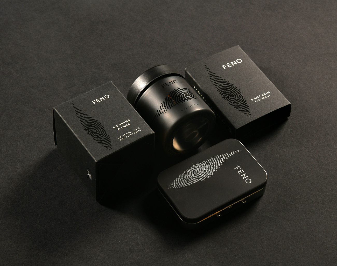
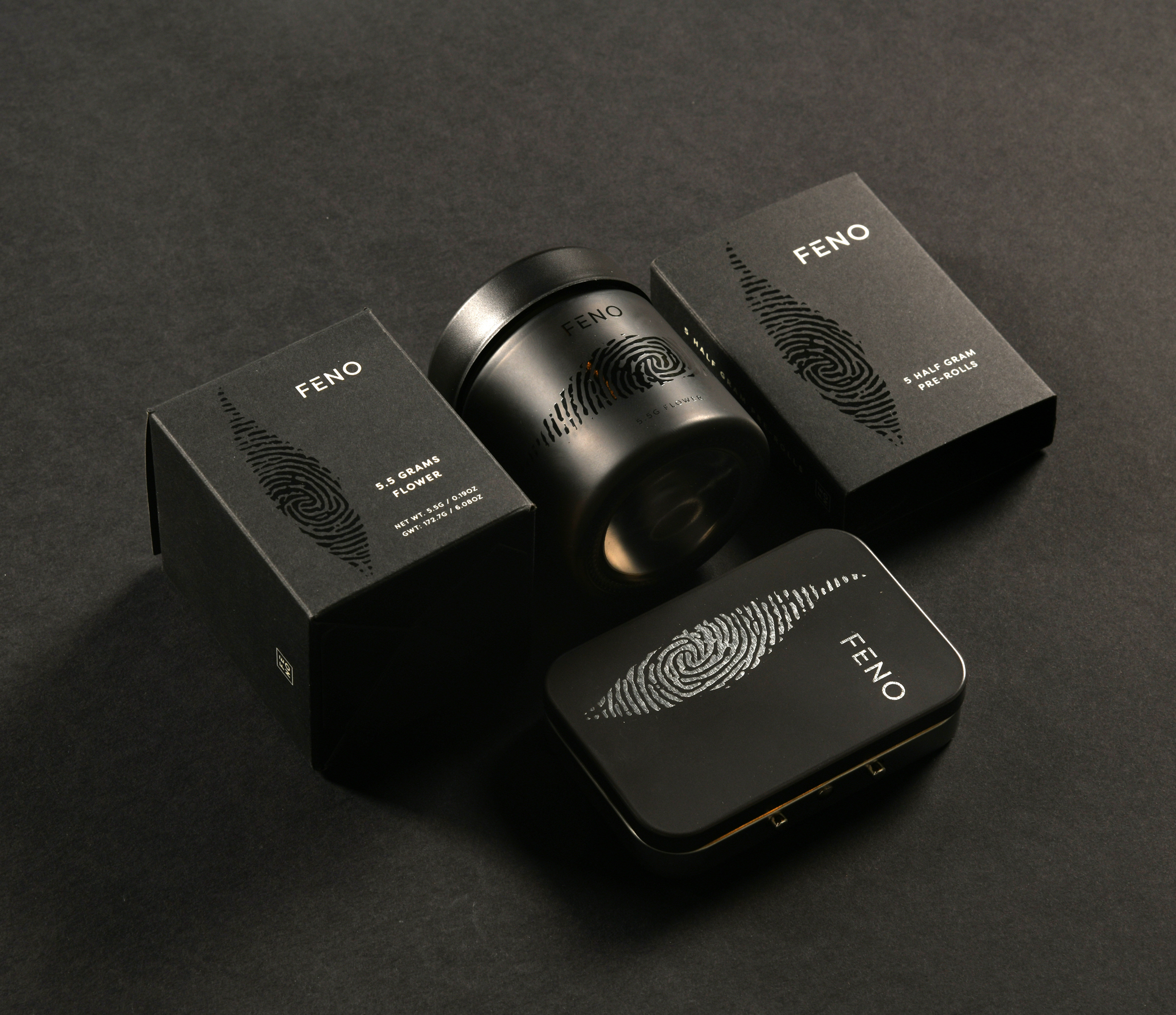
We elevated the packaging through thoughtful production. The fingerprint mark needed to appear consistently across glass, paperboard, and tin, which meant lots of focus on color matching and finishing—especially the black-on-black executions so that everything feels cohesive in hand and unmistakably Feno.
Product Display
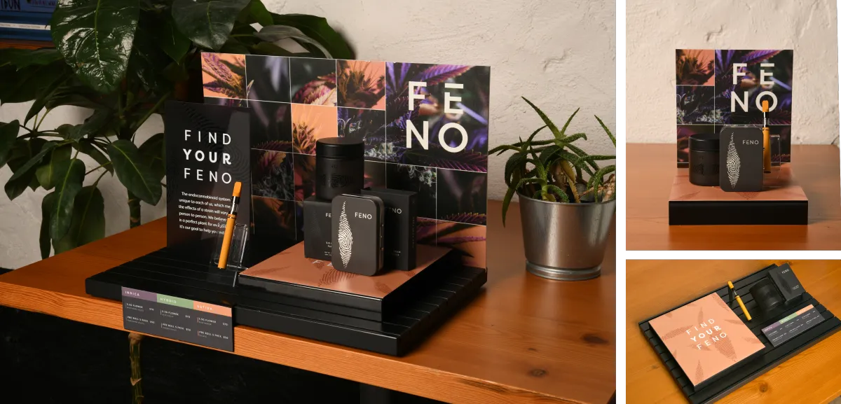
For retail, we built a modular system using Budder’s Groove hardware. It let us activate Feno cleanly across different store footprints—on-shelf, behind counter, or feature displays—while keeping the Fenoprints and macro imagery front and center.
See More CASE STUDIES


WORKING ON A PROJECT?
Get in Touch