

Fire in the Desert
Range’s founding team saw a gap in the Las Vegas product landscape. Despite being a global destination, Nevada had earned a reputation as a “flyover” cannabis state, known for convenience rather than quality. With Range, we set out to change that. Our goal was to build a top-tier flower and solventless concentrate brand that locals could be proud of and visitors would seek out.
SCOPE OF WORK
Creative Direction
Brand Origination
Visual Identity
Packaging Design
Product Display
CLIENT
Reggie Gilbert
Jared Anderson
Phill Wrightson
AGENCY TEAM
Laksman Frank, Creative Lead
Michael Marra, Creative Direction
Sarah Demers, Graphic Design
Jaya Frank, Design Manager
Strategy & Story
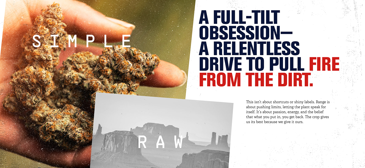
Range’s voice embraces grit, pride, and earned craftsmanship—positioning the brand as the team capable of coaxing extraordinary quality out of an unforgiving climate. The thematic idea of “growing fire in the desert” became a central brand pillar.
Range’s opportunity in the Vegas market was clear: stand apart through substance, not gimmicks. By homing in on high-consumption enthusiasts, solventless purists, and tourists seeking the very best, the brand could credibly claim leadership in a state hungry for a premium, authentic, grower-led identity.
Visual Identity
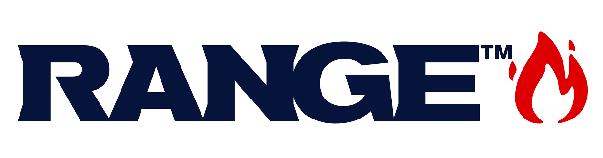
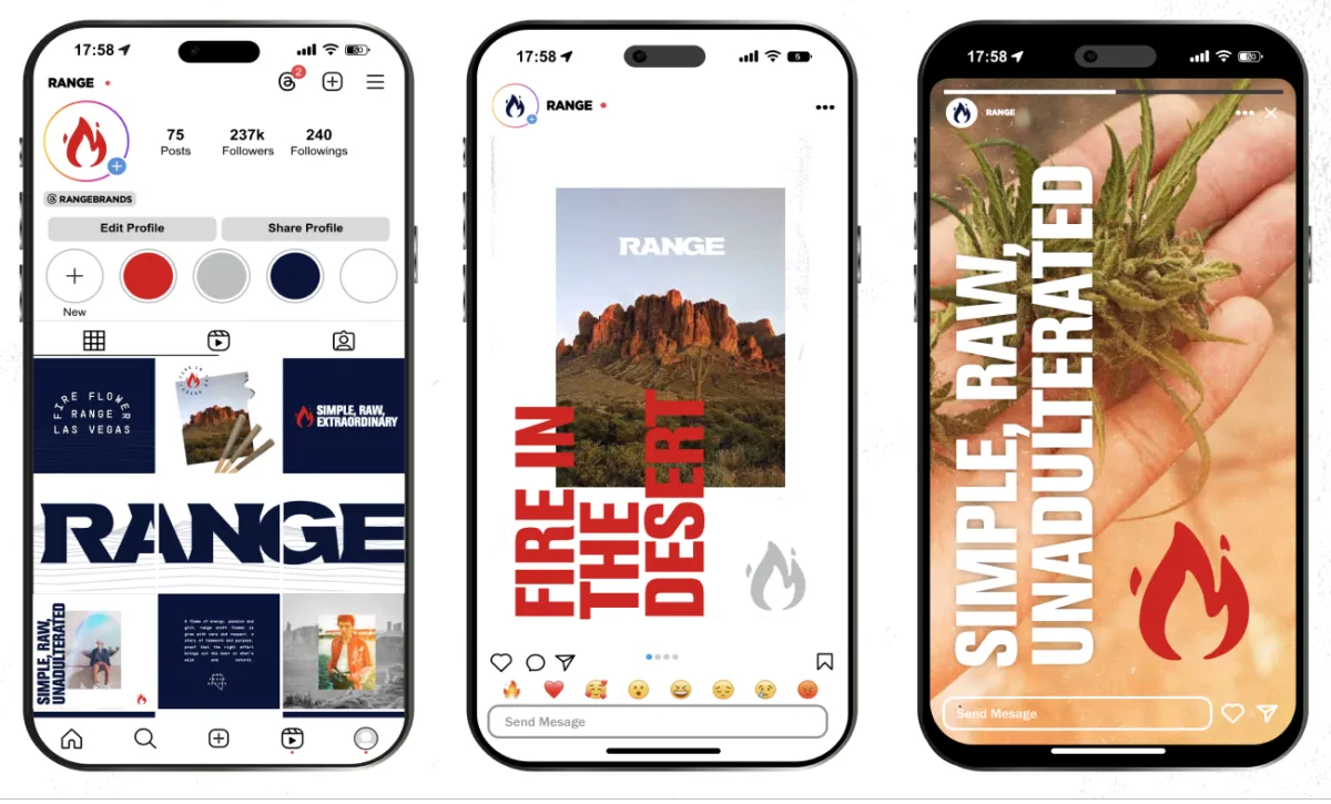
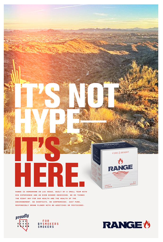
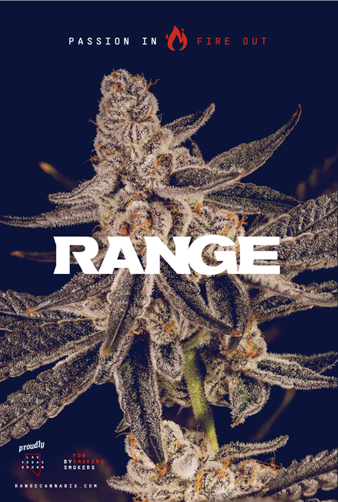
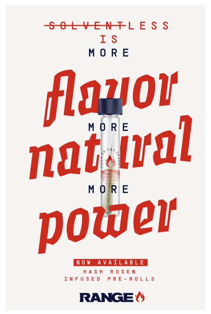
With “fire in the desert” as the brand tagline, we wanted the visual identity to hit that feeling right away. The extended and tightly kerned wordmark with added serifs gives the logo a chiseled, premium-rugged vibe. From there, we built a custom flame icon—born from an early “fire flower” sketch—that really carries the heat of the brand. To ground everything in Nevada, we added a simple graphic nod to the red sandstone peaks of Red Rock outside of the city.
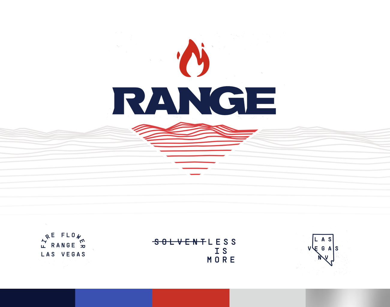
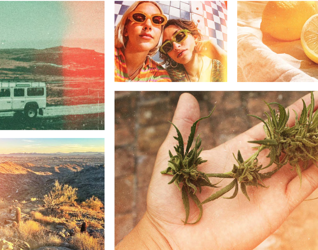
The brand’s color palette draws from desert nights and blazing fire, blending deep navy tones with bright, heat-inspired accents. For photography, we developed a “light leak” filter treatment that makes each image feel sun-kissed and slightly overexposed—giving a sense that the visuals themselves are of the desert.
Packaging
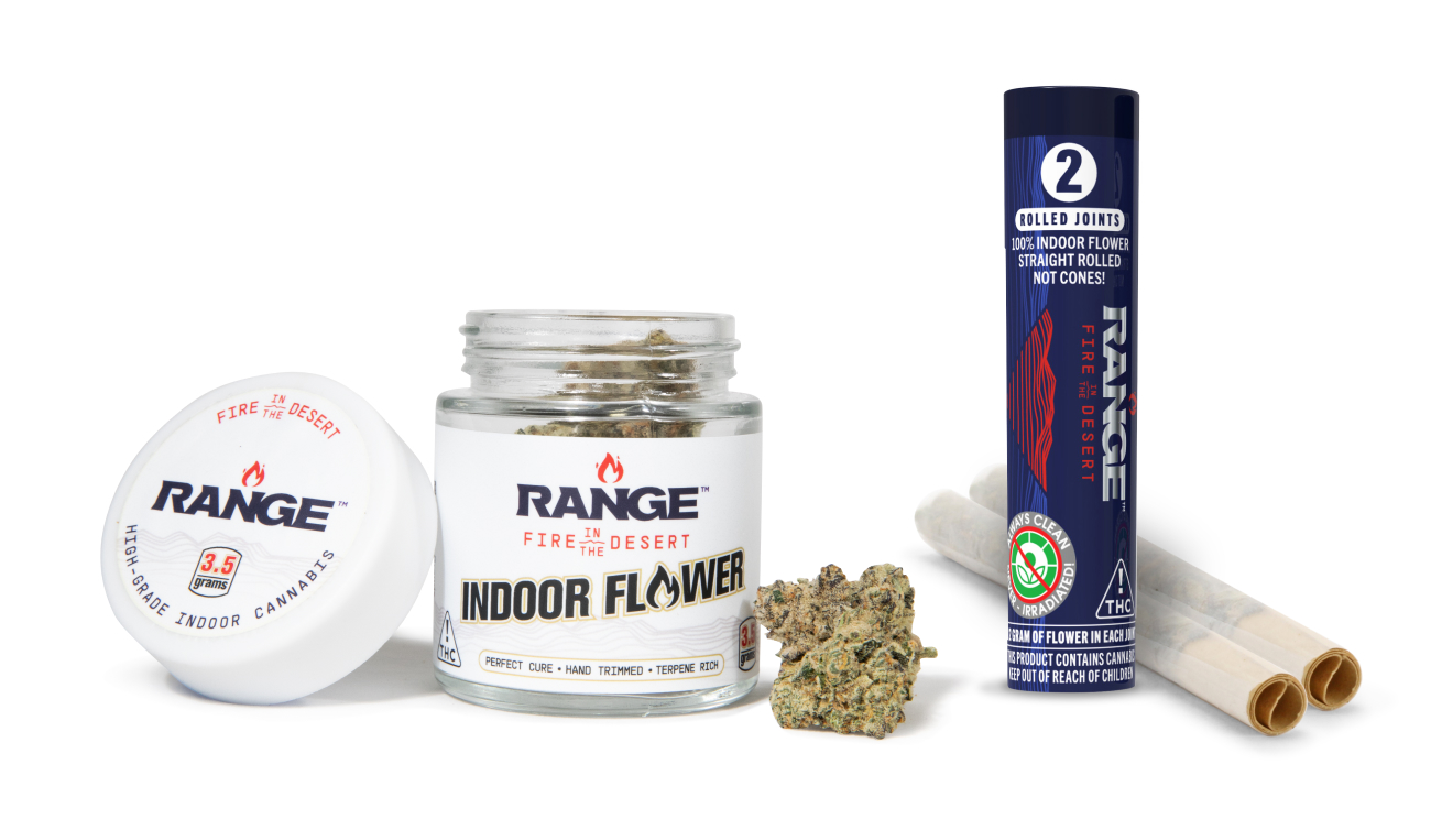
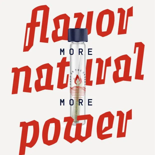
Range’s packaging was designed to be clean, bold, and instantly recognizable. As some Nevada brands lean heavily into red, we differentiated with a our navy blue and generous white space, using silver and red as accents.
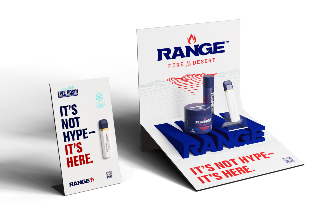
The POS display with 3D printed logo riser holds the physical product up, elevating it and helping it stand out on shelf.
See More CASE STUDIES
WORKING ON A PROJECT?
Get in Touch